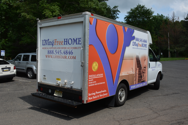
Whether you are marketing directly to customers or to businesses, you are not connecting with potential clientele if you do not identify your corporate brand on your fleet of box trailers as they roll down the highway. You build memorability and consistency for your brand with trailer graphics. North Jersey’s The Sign Center is your one stop shop for getting graphics work down.
Read More
Topics:
The Sign Center,
Trailer Graphics North Jersey,
Trailer Wraps North Jersey
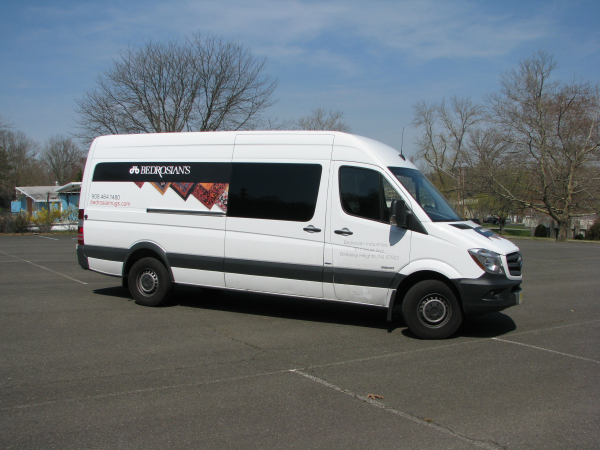
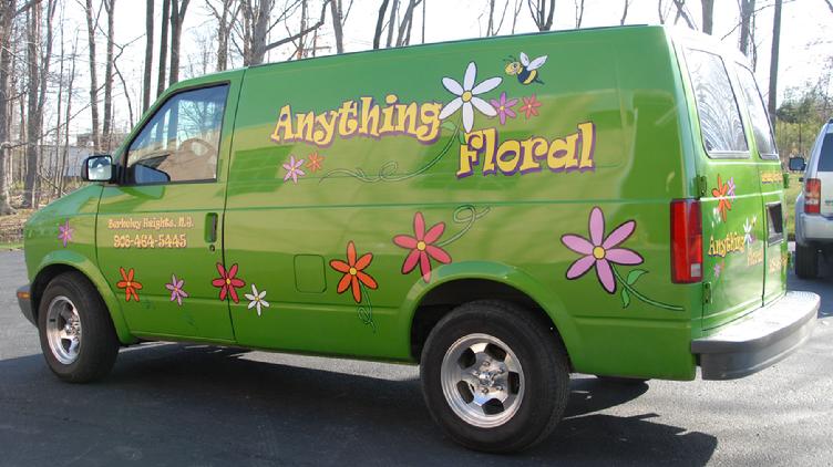
These days, if you want to succeed in business, you need to make your services extremely convenient for your customers. Consequently, more and more companies are offering delivery or are willing to come to homes or businesses to provide assistance. You would expect these service and delivery vehicles to advertise which companies they are with. However, we have found this is not always the case.
Read More
Topics:
The Sign Center,
Van graphics North Jersey,
Service and delivery van graphics North Jersey
When it comes to vinyl, there are few manufacturers that can compare to 3M’s quality. 3M is known throughout the world for specifically manufacturing vinyl for use on cars. Since The Sign Center uses 3M vehicle wraps for North Jersey, you can expect your wrap to fit perfectly, last longer, and look great! Best of all, 3M provides many options to choose from. Read on to learn more!
Read More
Topics:
The Sign Center,
3M Vehicle Wraps North Jersey,
3M Car Wraps North Jersey
Whenever customers come to us looking for vehicle wraps, we always go over the many different options available to them. After going over the different types of wraps, we almost always get the same question: “What are matte black vinyl car wraps?” We are going to use today’s blog post to go over what matte black vinyl is and how you can best use it on your automobile.
Read More
Topics:
The Sign Center Berkeley Heights NJ,
Black matte vinyl car wraps North Jersey,
3M Black matte vinyl car wraps
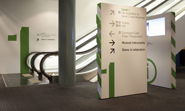
Wayfinding signs have been an important part of helping humans get around ever since Ancient Rome. These days, there is an entire field devoted to helping people get from point A to point B. It is called environmental graphic design, or “wayfinding.” Recently, the podcast 99% Invisible tackled how wayfinding is used in both overt and covert ways to help people find their way around airports.
Read More
Topics:
Wayfinding signs North Jersey,
Directory Signs North Jersey,
The Sign Center Berkeley Heights NJ
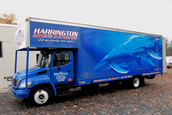
Vehicle wraps are the hottest products in the signage industry these days. Just about every business that has vehicles on the road during the day has vinyl graphics or wraps. But, how are vehicle wraps designed and installed? And, are they right for your business? This blog entry will unwrap the mystery surrounding these effective advertising tools and answer the question, “What is the vehicle wrap process?”
Read More
Topics:
The Sign Center,
How does the vehicle wrap process work,
Vehicle wraps for North Jersey
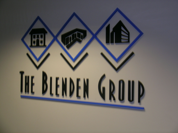
When it comes to custom business signs made to order for local companies, we at The Sign Center are constantly getting questions. We have compiled four of the most common business signage questions and their answers here to help you with your buying decisions. This is a must read before you get your custom signs in North Jersey.
Read More
Topics:
vehicle wraps North Jersey,
business signage North Jersey,
The Sign Center Berkeley Heights,
NJ
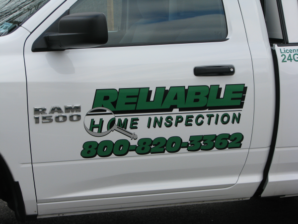
There are several delivery and courier services in North Jersey. As such, on the streets of North Jersey, you often see many delivery trucks and vans for service providers and retailers. An affordable and smart use for your company’s advertising budget is making the most of each time your company vehicles are on the road. To help you stand out, The Sign Center can outfit your fleet with truck lettering for North Jersey.
Read More
Topics:
The Sign Center,
Truck lettering for North Jersey,
Vehicle Vinyl lettering North Jersey
One question we get all the time is “Do vehicle wraps damage paint jobs?” The short answer is “Not at all!” The longer answer is the subject of today’s blog entry. When you are having graphics installed over your paint job, there are a few different factors you need to think about.
Read More
Topics:
The Sign Center,
will car wraps damage my paint,
guide to car wraps
With how much wraps are used to market companies, it always surprises us when we hear about or see wraps that are not cared for properly or at all. We have repaired wraps where the owner got in an accident six months after the installation, there were still grease pencil alignment marks on the wrap from the original installation. This wrap clearly had not been cleaned at all. To help you keep your wrap clean so it can represent your business well, The Sign Center has put together this little guide so you too will learn the importance of caring for your vehicle wraps.
Read More
Topics:
The Sign Center,
Caring for your vehicle wraps,
how to clean vehicle wraps